Understanding how color theory can influence emotions and enhance the mood and message of digital designs is fundamental for creating effective visual experiences. Colors have a powerful impact on our feelings, perceptions, and actions, and using them wisely can transform a digital space into an immersive and meaningful journey for users.
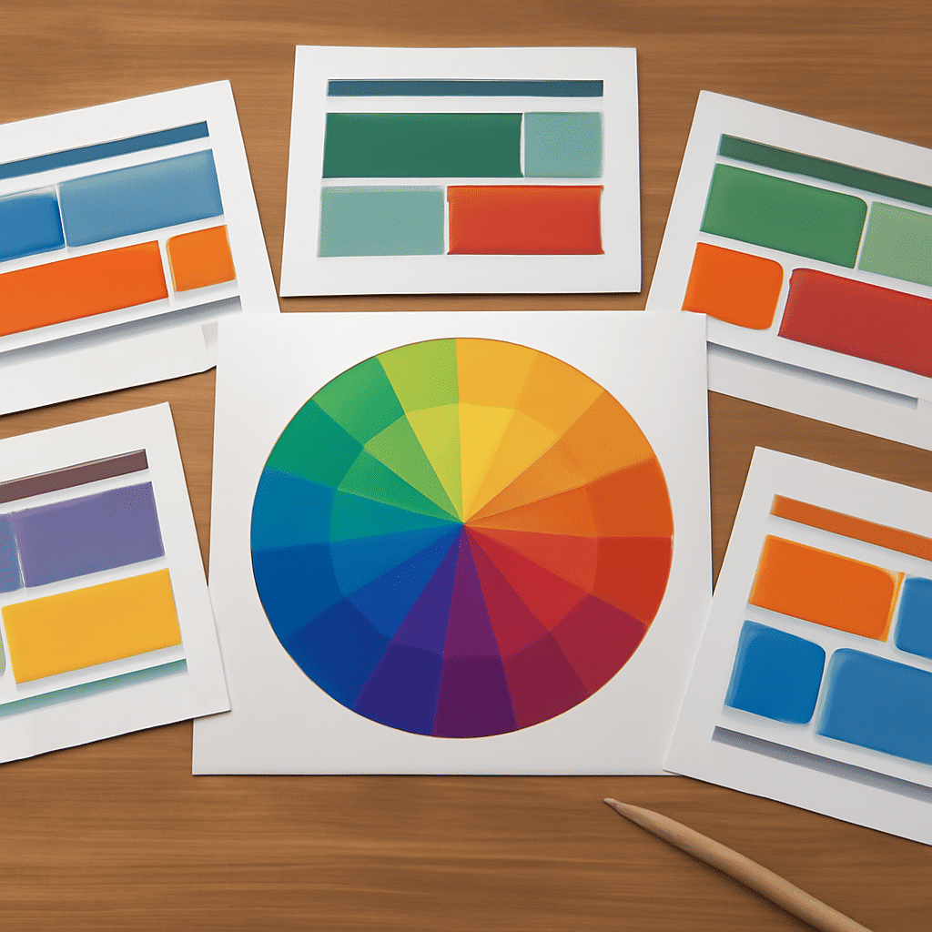
Color theory is an intricate field that combines art, psychology, and design. It revolves around the color wheel, a circular diagram of colors typically including primary, secondary, and tertiary colors. Understanding how these colors interact and complement each other is crucial for creating a harmonious design.
One of the basic principles of color theory is the use of complementary colors. These are pairs of colors that, when combined, cancel each other out and produce a grayscale color like white or black. When placed side by side, these colors create a strong contrast, making each other appear more vibrant. For instance, using blue and orange can add dynamism and energy to a design, capturing the viewer's attention.
Analogous colors, which are next to each other on the color wheel, offer a more cohesive and serene aesthetic. These color schemes are often found in nature and create a pleasing look. Using analogous colors in design can evoke a sense of tranquility and harmony, making it suitable for relaxed and friendly contexts.
Beyond the mechanical application of these principles, colors are deeply connected to psychological effects. Warm colors like red, orange, and yellow can evoke feelings of warmth, excitement, or urgency. Red, for example, is known to increase pulse rates and create a sense of urgency, making it effective for drawing attention or indicating caution.
Cool colors such as blue, green, and purple tend to be calming and soothing. Blue is often associated with trust and serenity, making it a common choice for promoting reliability and professionalism. Green can evoke thoughts of nature, growth, and health, creating a relaxing and refreshing ambiance.
Neutral colors, including whites, grays, blacks, and browns, are essential in providing balance and offsetting the vibrancy of other colors. They act as a subtle backdrop, allowing brighter colors to pop without overwhelming the viewer. Skilled use of neutrals can add elegance and sophistication to a design.
Cultural context is another factor that influences how colors are perceived. Different cultures associate various meanings with colors. For example, while white is often linked to purity and weddings in Western cultures, it is associated with mourning in some Eastern cultures. Designers need to be mindful of these differences, especially for global audiences.
Incorporating color psychology in digital design involves contemplating not only aesthetics but also the emotional journey you wish to create for viewers. Selecting the right colors can guide a user's actions, from encouraging them to explore content to prompting decisions. A thoughtful color palette can enhance user engagement and convey a brand's message more effectively.
Ultimately, mastering color theory empowers creators to devise digital spaces that resonate on an emotional level. By understanding and respecting the various implications colors have, designers can craft more compelling and emotionally engaging experiences. The strategic use of color in design can spark joy, inspire trust, and create a lasting impression that aligns with the intended message and tone.