Visual hierarchy is a fundamental concept in design that plays a crucial role in how users engage with content online. By organizing elements in a manner that naturally guides the viewer's eye, designers can create a seamless and intuitive experience that enhances comprehension and interaction.
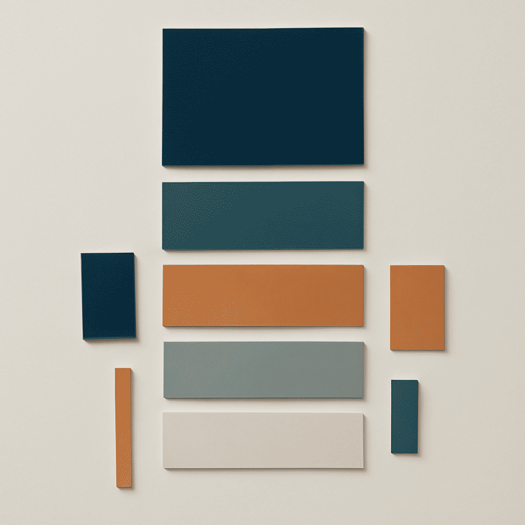
At its core, visual hierarchy leverages principles like size, color, contrast, alignment, and space to prioritize information. Larger elements often draw more attention than smaller ones, making size a powerful tool for emphasizing key pieces of content. For example, a headline in bold, large typography commands attention and implies importance, naturally leading the reader's gaze to it first.
Color is another influential factor in establishing hierarchy. Bright and bold colors can attract attention, whereas muted tones might recede into the background. Contrast between elements, such as using light text on a dark background, can also direct focus and improve readability, ensuring that the most critical information is readily accessible.
The alignment and organization of content contribute significantly to hierarchy. Center-aligned elements may stand out more prominently than those aligned to the side, while a well-structured grid layout can help guide the viewer's eye in an orderly fashion. Using whitespace effectively, designers can create breathing room that prevents a cluttered appearance and intuitively steers the eye from one section to the next.
Employing these principles strategically enhances user experience by allowing individuals to scan content more effectively, comprehending the structure and narrative without unnecessary effort. It fosters engagement by leading users through a path where their attention is naturally directed to where it's intended.
Ultimately, understanding and implementing visual hierarchy is essential in creating impactful and user-centric design. Whether crafting a promotional page, an informative blog, or an interactive interface, a well-planned hierarchy can make the difference between a page that's glanced over and one that's truly absorbed. By mastering this art, designers can ensure their messages are communicated clearly and compellingly, fostering a deeper connection with their audience.